

From product posters and short videos to outdoor billboards, these 10 advertising concepts from the Wery community show how products, settings, and information hierarchy work together.
When evaluating advertising creative, it is easy to focus only on whether the final image looks good. More useful, however, are the decisions behind it: how much space the product occupies, whether a person is demonstrating a feature or representing a lifestyle, and whether color improves recognition or simply adds noise. These choices determine whether an image or short video can work effectively in a real-world campaign.
For this collection, we selected 10 creations from the Wery community covering technology, youth marketing, food and beverage, fashion, beauty, wellness, and outdoor advertising. We looked for a clear visual focus, a meaningful connection between the product and its setting, and an idea that could be adapted into social media, e-commerce, or broader campaign assets.
A quick note: creations featuring brand names are community-made concepts and do not represent official advertising from those brands. Use them to study composition, pacing, and information hierarchy, then adapt those ideas to your own products and brand language.
Featured Advertising Concepts
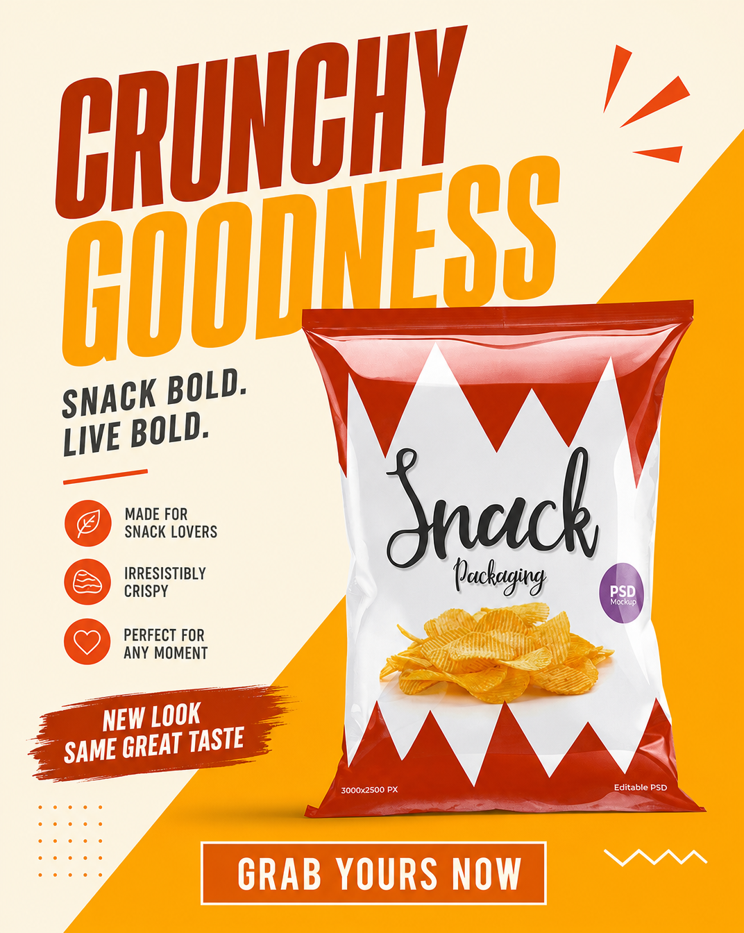
Oversized headlines, bold orange-red contrast, and centered snack packaging establish a clear focal point immediately. Short selling points and a strong call to action complete the promotional message, making this format well suited to product launches, limited-time discounts, and other promotional campaigns.
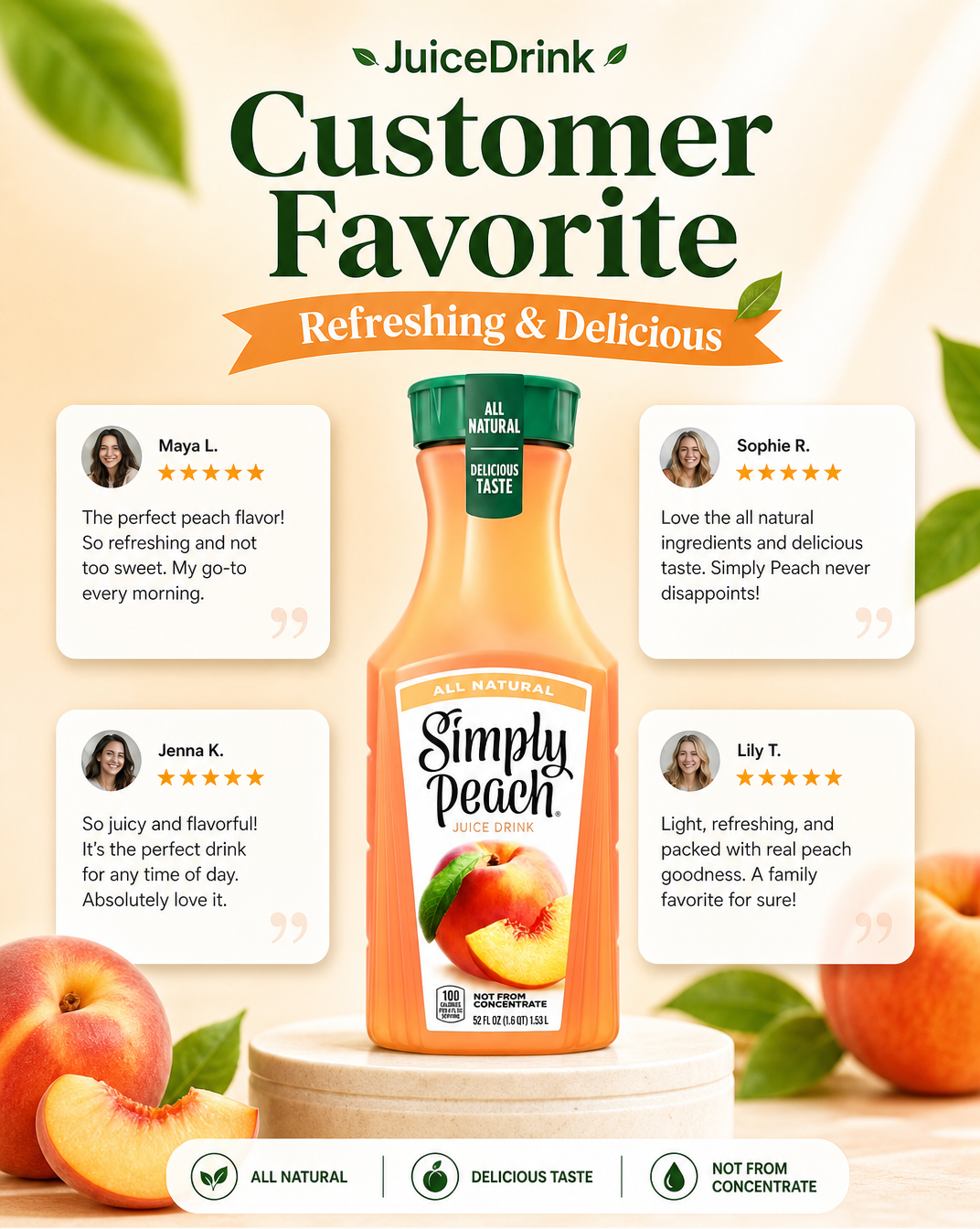
The poster places the product at the center, surrounded by customer avatars, ratings, and short reviews. This makes details such as flavor, ingredients, and the overall drinking experience feel more concrete while building more credibility than a simple list of product claims.
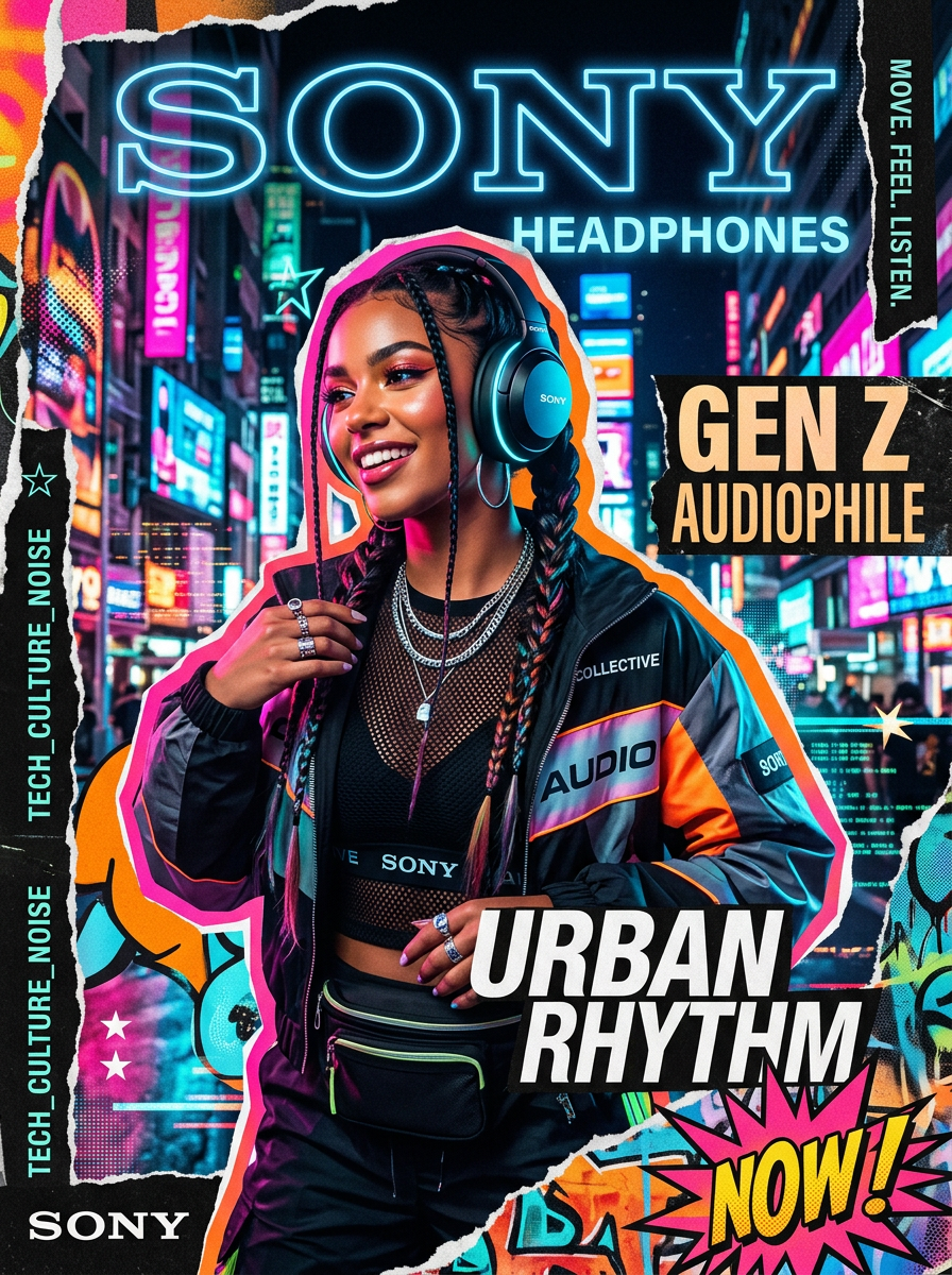
This Sony headphones concept uses neon colors, sticker-like graphics, and street-style typography to create a strong visual rhythm. Showing the model wearing the headphones places the product naturally within a lifestyle context, turning music into a form of identity and self-expression.
Beverage advertising faces a simple challenge: how do you make a drink look fresh, flavorful, and irresistible on screen? Mango naturally offers vibrant color and a rich texture. Close-ups of the fruit, flowing liquid, and quick transitions use those qualities to create immediate sensory appeal and make the drink feel worth tasting.
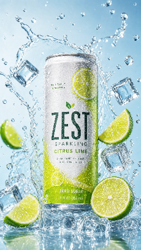
Splashes of water, floating ice cubes, and lime slices burst around the can, turning “ice-cold refreshment” from a packaging claim into a visual sensation viewers can almost feel. The pale blue background reinforces the clean, chilled atmosphere, while bright yellow-green accents draw attention back to the product.

This futuristic fashion visual positions the shoe prominently in the foreground, using cool whites, pale blues, and generous negative space to create a refined, technology-inspired atmosphere. The model’s pose, the texture of the clothing, and the scale of the shoe establish a clear visual hierarchy. Geometric lighting in the background subtly reinforces the tech-forward mood without distracting from the product.
The video uses a top-down perspective to capture the full unboxing process: opening the package, moving aside the tissue paper, and taking out the face cream. Light taps on the container and close-up product shots highlight the packaging and its texture. Natural lighting, a wooden tabletop, and real ambient sound make the experience feel more personal and hands-on—as if viewers were opening the product themselves.
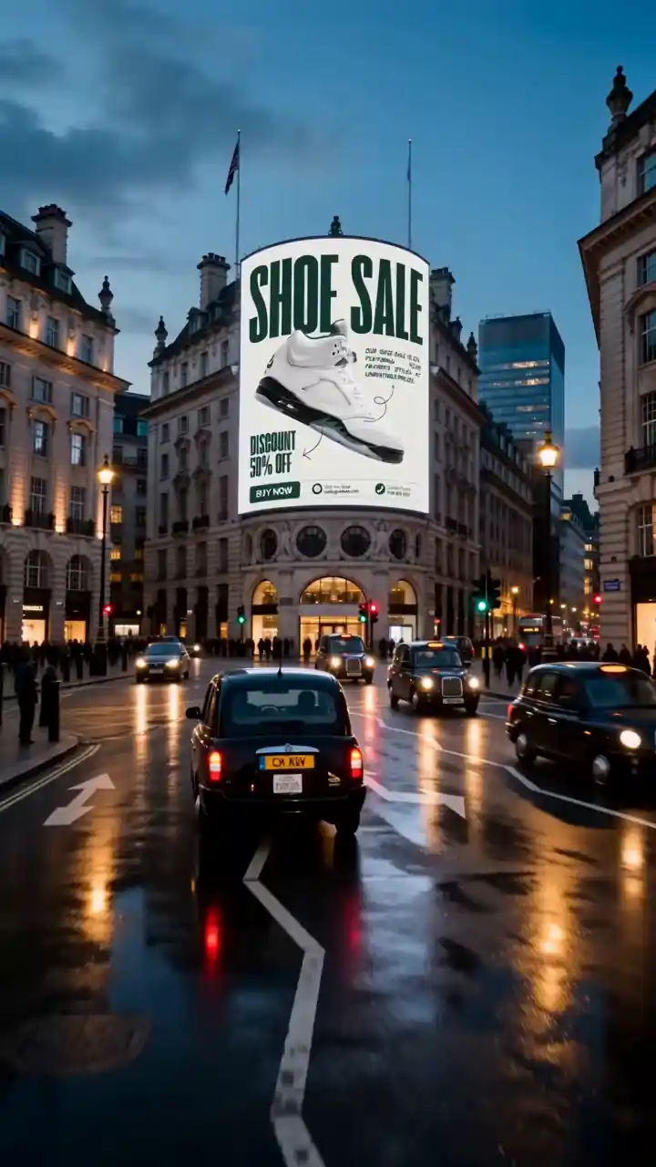
This concept places a brand advertisement on a large screen in Piccadilly Circus. The composition keeps the primary visuals and copy clear and legible, while surrounding streets, crowds, and city lights create a convincing real-world campaign setting. Placing an advertisement in a recognizable location can also help creators evaluate whether the concept remains effective when surrounded by visual noise.
The video opens with a familiar pain point: feeling tired and low on energy. It then uses product shots, voice-over, and captions to introduce three key selling points in sequence. This structure makes the product information easier to follow while keeping the video concise and well suited to social media.
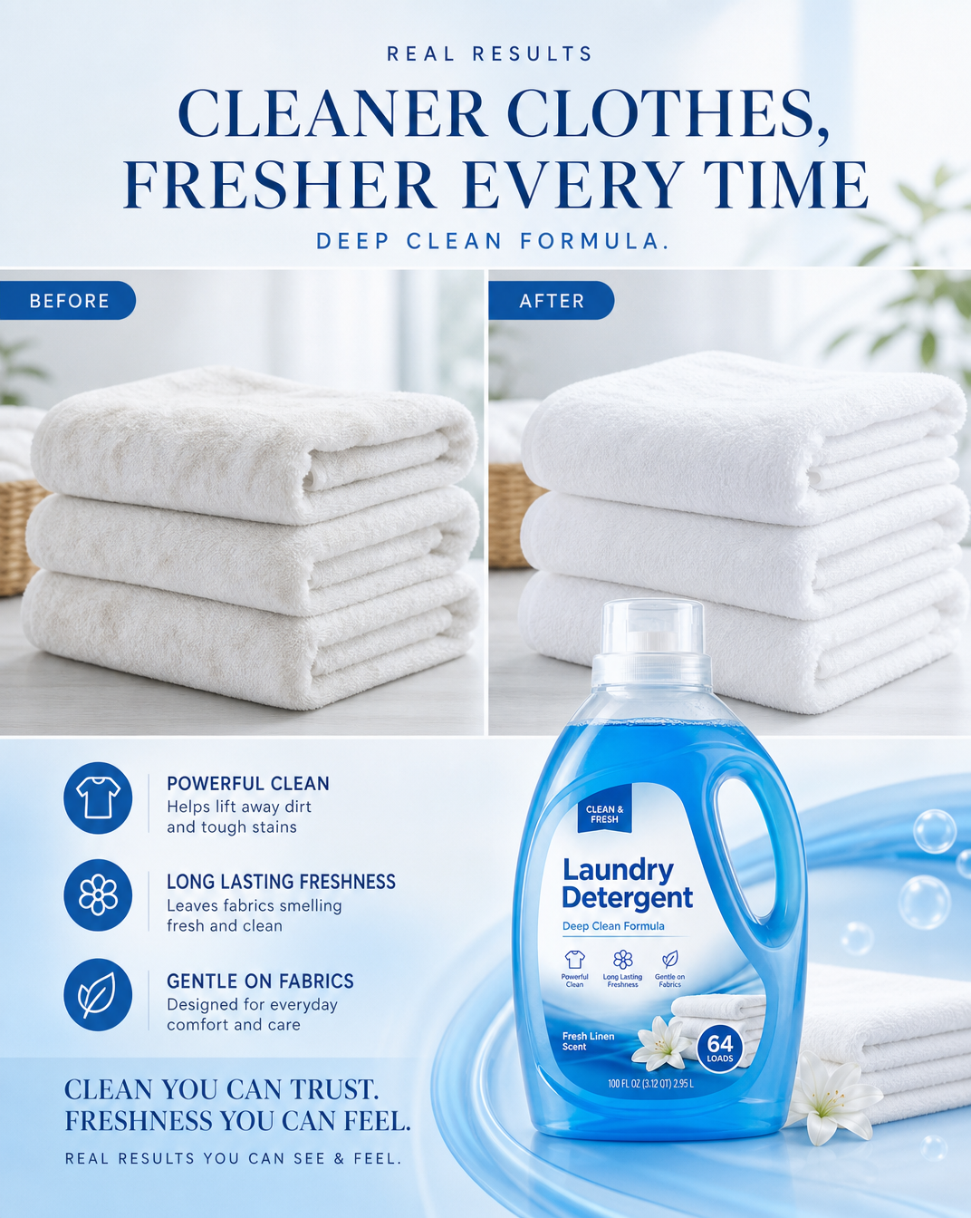
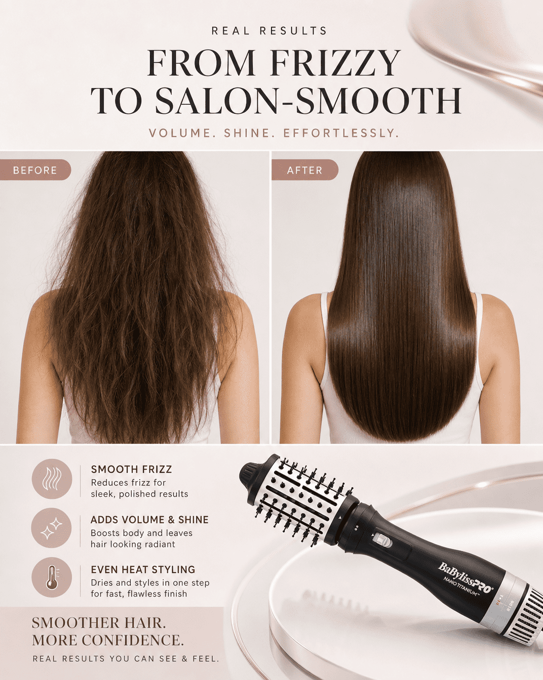
The poster uses clearly defined Before and After sections to make the transformation immediately visible, with the product positioned at the bottom as a visual anchor. Compared with a list of benefits, this structure communicates the product’s value more quickly and gives viewers a clear reason to continue reading.
What Can We Learn from These Advertising Concepts?
The most useful lesson is not one fixed visual style, but the way each concept gives the product a clear role. A consumer electronics product can use a futuristic city to reinforce innovation. Headphones can use people, street graphics, and expressive typography to connect with younger audiences. Fashion advertising can use scale and posture to communicate attitude, while beverage, beauty, and outdoor concepts can focus on taste, texture, transformation, or instant recognition. The setting should never be treated as decoration alone. It should help viewers understand the product and the intended message more quickly.
Before creating your next advertising asset, ask three questions: What will viewers notice first? Does the setting reinforce the intended impression of the product? Can the concept be adapted into vertical videos, e-commerce images, or social media assets in different formats? Answering these questions before choosing colors, camera angles, and typography is usually more effective than copying the surface style of a single advertisement.
Turn One Creative Direction into a Campaign System
Once you find a direction that works, open the corresponding creation in the Wery community and begin adapting its key elements. You can change the product, people, setting, color palette, copy, and aspect ratio while preserving the underlying visual logic. A single key visual can become a set of social media posts, e-commerce images, display ads, and campaign variations. A video concept can be divided into an opening hook, product close-ups, selling-point sequences, and a closing scene. Start by building one clear visual system. You can then adapt it across different sizes and formats to create a more consistent campaign.
Create These Ad Formats Faster with Wery Templates
Once you have chosen an advertising direction, continue with a Wery product template. Upload your own product image and replace the product information, selling points, colors, or setting to turn community inspiration into launch posters, customer-review ads, short videos, and before-and-after creatives. Each template already includes a visual structure and information hierarchy, making it easier to test a direction before expanding it into multiple sizes or a complete campaign.
Recommended Product Advertising Templates. Click an image or template name to open it.

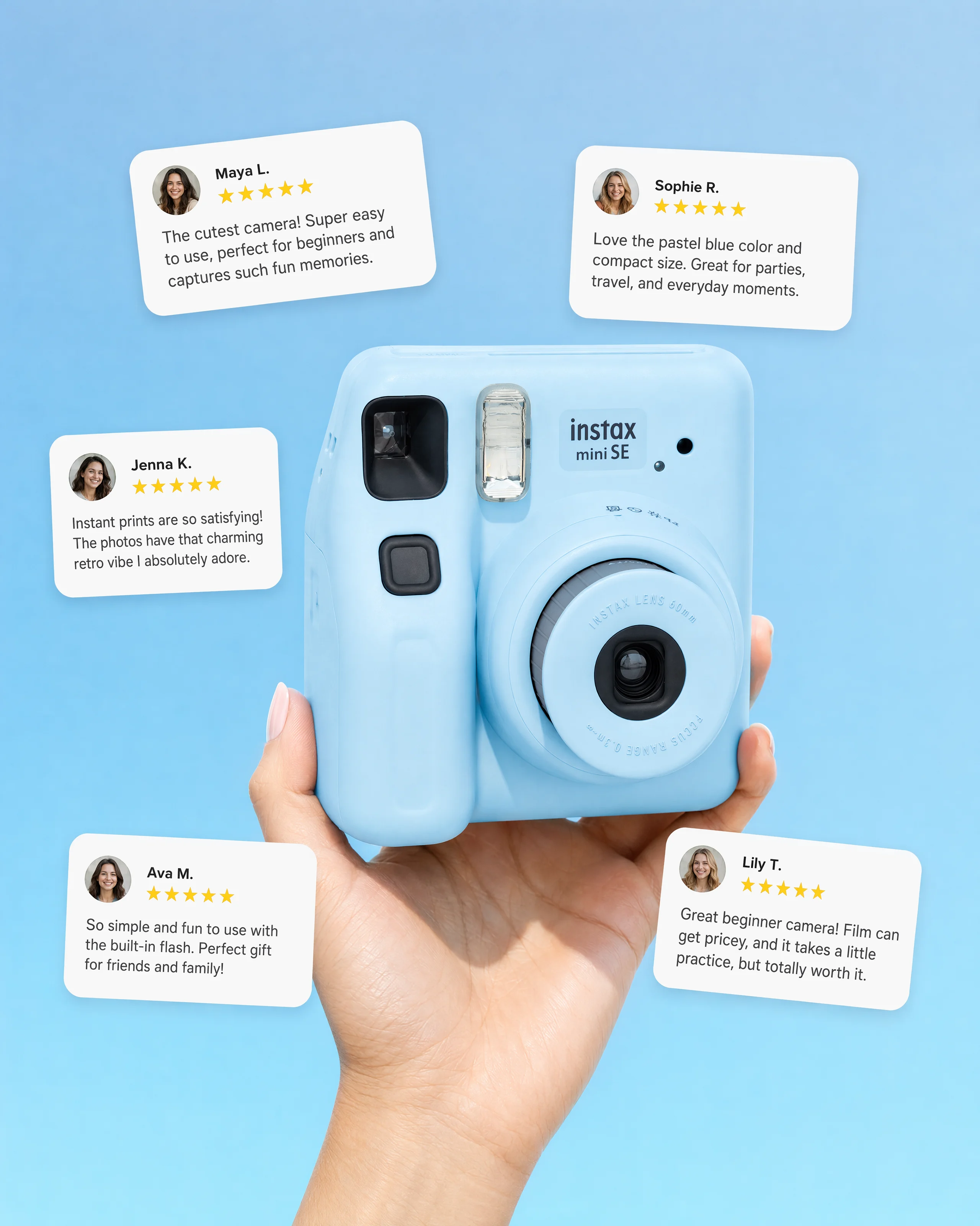
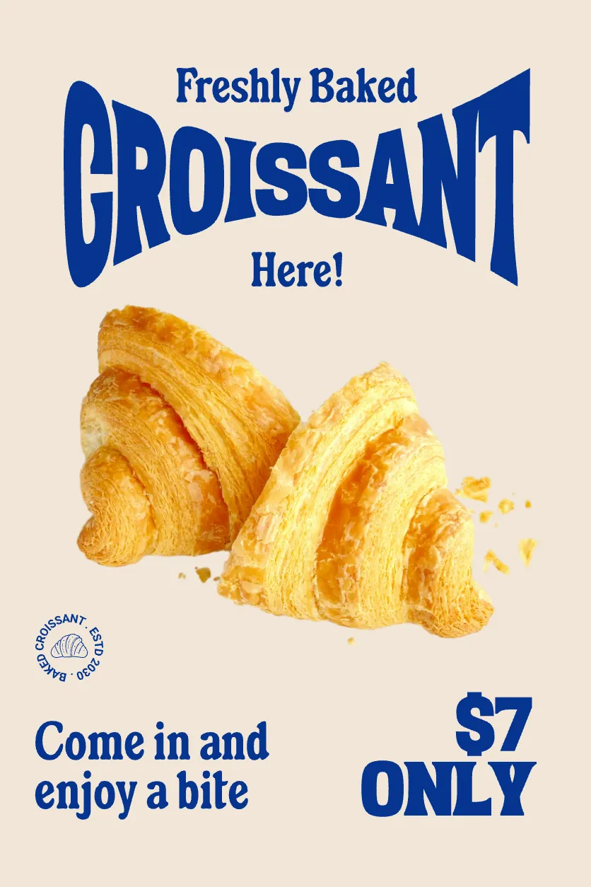
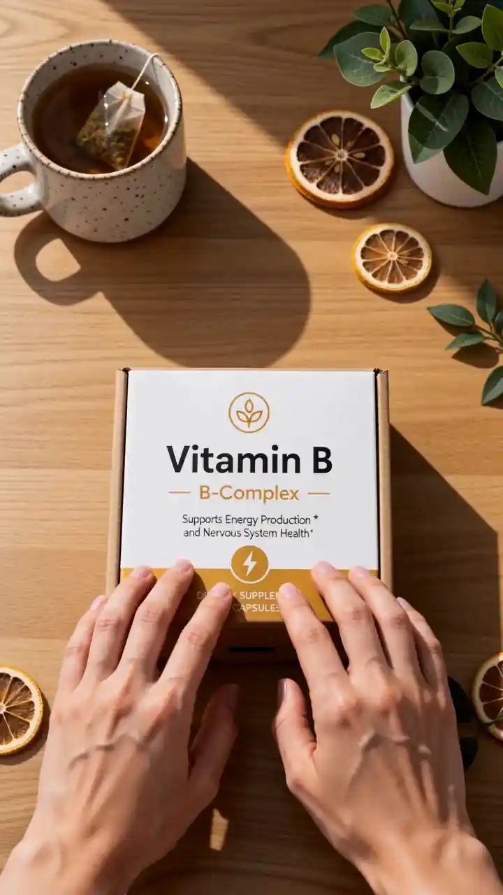

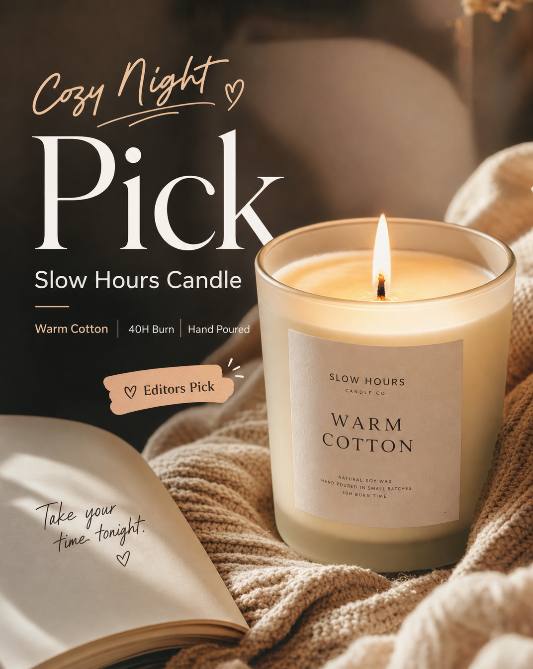
When using these templates, begin with one clear goal: showcase the product, explain its selling points, create a particular mood, or support a promotion. After generating the creative, check the product shape, packaging color, logo, label text, and aspect ratio. If the source image does not clearly show a particular side of the product or any fine print, the AI may fill in those details inaccurately. Always review important product information manually before publishing.