Poster design has to do a lot at once: stop the scroll, make the message clear, and still feel visually distinctive. That makes posters especially useful as references, whether you are building a Pinterest mood board, planning an Instagram post or Story, promoting an event, or simply looking for a stronger layout for your own work. Small choices such as where the subject sits, how the text is grouped, and how color directs the eye can completely change how a poster reads.
For this roundup, we picked 10 very different posters from the Wery community, covering zodiac themes, campus recruitment, event announcements, city visuals, character art, music, and birthday invitations. We looked for designs with a clear focal point, easy-to-follow information, and enough visual personality to inspire more than a single post.
Some are worth saving for their layout, while others stand out for the mood they create. If you are gathering Pinterest inspiration, planning Instagram content, designing event materials, or working on a poster of your own, these examples offer plenty of details to learn from.
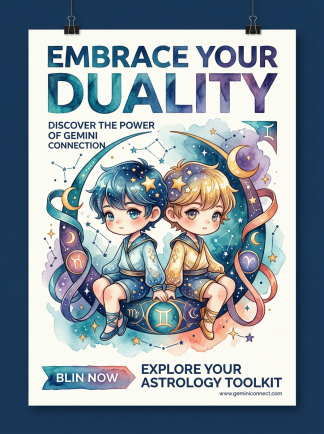
Gemini imagery comes with plenty of familiar symbols, so it is easy for the page to feel busy. This poster keeps the two characters at the center and uses bright color, stars, and small decorative details to build personality around them. The style also has obvious series potential. Keep the same character proportions, palette, and framing, and the idea could easily expand into all twelve zodiac signs.
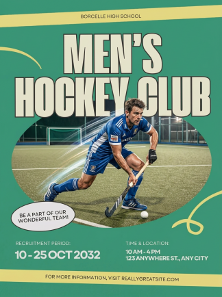
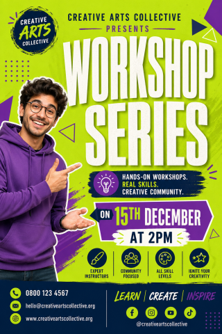
You know what this poster is for almost immediately: team recruitment, sign-ups, social sharing, or a printed notice on campus. The information is easy to spot, but the design still feels energetic and athletic. That balance makes it a useful reference for any poster that needs to communicate practical details without losing its visual impact.
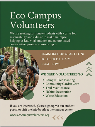
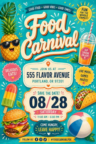
Event posters often have to carry a date, location, theme, and sign-up information all at once. This design keeps the reading order clear and uses color and graphic elements to separate the important details. Nothing feels hard to find, and the page still has enough personality to work as a proper poster rather than a plain announcement. It is a good reminder to solve the information structure before adding more decoration.
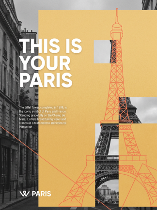
Paris posters often start with the Eiffel Tower, but the strongest part of this design is the overall atmosphere. The generous spacing, warm color block, and layered city imagery create a relaxed, editorial travel feel. It could work as a travel blog cover, a city-themed social post, or the kind of visual people save to a Pinterest board for future inspiration.
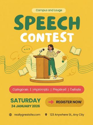
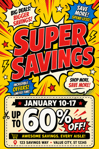
One strong poster is hard enough; a full series also needs a visual system that holds together. These campus competition designs use consistent typography, color, information blocks, and spacing while leaving room for each event to have its own identity. That makes the format easy to extend when a new competition, date, or category is added.
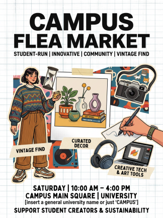
This one feels immediately tied to campus life. The objects, illustrated character, and market details make the event easy to understand before you even read the smaller copy. That familiarity also makes the concept easy to adapt. Swap in your own date, location, and theme, and the same structure could work for a school fair, club market, or community event.
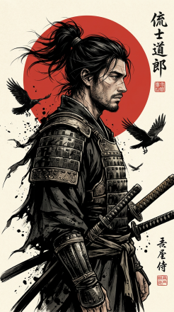
The character does most of the visual work here. Your eye lands on him first, then moves into the birds, red sun, armor, and smaller story details around the frame. The strong silhouette and controlled negative space give the piece enough structure to work as a poster, even though it leans heavily into illustration. The same approach could suit a game concept, story cover, character campaign, or cinematic social visual.
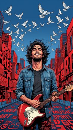
A good music poster should give you a sense of the sound before you hear it. The lighting, expression, guitar, and graphic city setting make the mood immediate here. The same visual direction could easily carry over to a concert announcement, playlist cover, indie music feature, or Instagram post, with enough personality to become part of a recognizable series.
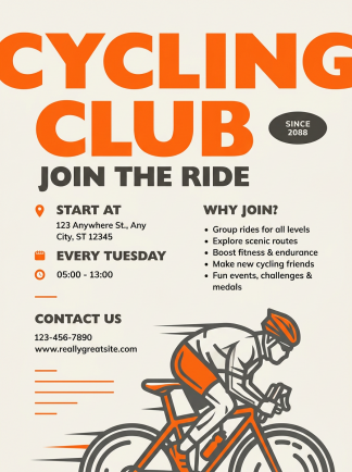
When a poster moves into English, the layout usually needs to move with it. This design uses type size, spacing, and information grouping in a way that feels comfortable for English readers. It is a useful reference for multilingual work, where the copy, typography, and layout all need to be adjusted together so the finished design feels natural.
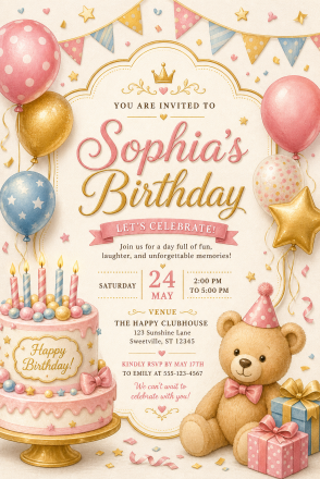
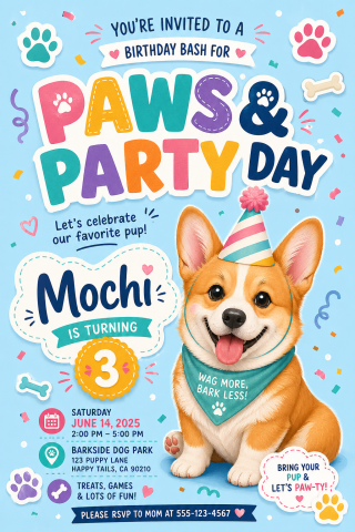
Birthday invitations are small pieces of design, but people actually save, send, and share them. This one makes the important details easy to find while keeping the overall look cheerful and personal. The same approach could work for family celebrations, anniversaries, kids’ parties, or other small events where the design should feel warm and easy to customize.
Turn Inspiration into a Poster with Wery Templates
Recommended Poster Templates